A call to action is the prompt you provide to get a prospect to take action at the end of an email, web page, blog post, or social media post. It’s usually something short and snappy – “Click here for a free quote,” for example.
Even though it only contains a few words, your call to action is a key component of your sales funnel. But what if you could make those words work even harder for you?
If you’re not seeing the conversion rates you’d like, you may need to pick one of your marketing pieces and optimize a call to action. Luckily, there's an easy way to perform multiple tests without, say, revamping your whole website or creating new social media ads from scratch. Here's how to get started.
Step 1: Decide What to Test
So we’re going to A/B test a call to action…but which one?
First, make a list of your current calls to action. What entry points are there for your marketing funnel? Here are a few common entry points:
- Your website's home page
- Your quoter
- Your Facebook page
- Landing pages
- Blog posts
- Social media posts
Make a simple spreadsheet that lists all your funnel entry points and the calls to action they use.
Next, consider which of those funnel entry points is likely to have the biggest impact on your lead supply. Also consider how dependent you are on those leads for your income stream. Let’s say you have a landing page that currently delivers you 30 qualified leads per week, and accounts for 80% of your sales. You probably don’t want to do random testing on this page and risk affecting your incoming leads. But you could replicate the page, tweak your call to action, and compare the results of the two pages. That would be a smarter way to run tests without damaging the lead supply you’ve come to rely on.
For your test, select an entry point that’s your third or fourth most productive lead source. This might be the call to action on your Facebook page, a landing page, or a specific page on your website that gets a fair amount of traffic, for example.
Step 2: Plan Your Test
Unless you know what you changed and when, it will be almost impossible to evaluate your results. First, write down what you’re going to test and when. You’ll also need to gather some baseline metrics to help you judge how effective your changes will be.
When you plan your test, be sure you allow a testing period that accounts for any expected surge or decline in traffic. For example, a test that runs the week after Christmas will probably produce deflated results since web traffic will likely be lower that week. If most of your web traffic is local, keep in mind that storms that knock out the power can also affect your test. Run your test for 2-6 weeks to allow for a normal range of spikes and troughs in traffic.
Here’s an example of basic test planning:
- Which page or platform will you test?
- The “Get a Quote” button for the quoter on my final expense web page (http://mysite.com/finalexpense).
- How long will your test run?
- March 1 – April 15.
- What are you changing?
- Old quoter button text: View Rates
- New quoter button text: Get My Free Quote
- What is your control period?
- January 1 – February 15.
- Baseline traffic and conversion during the control period:
- Google Analytics web traffic for that specific page: 432 unique sessions
- Final expense leads posted to my CRM: 25 leads
- Page conversion: 5.78%
Step 3: Run Your Test
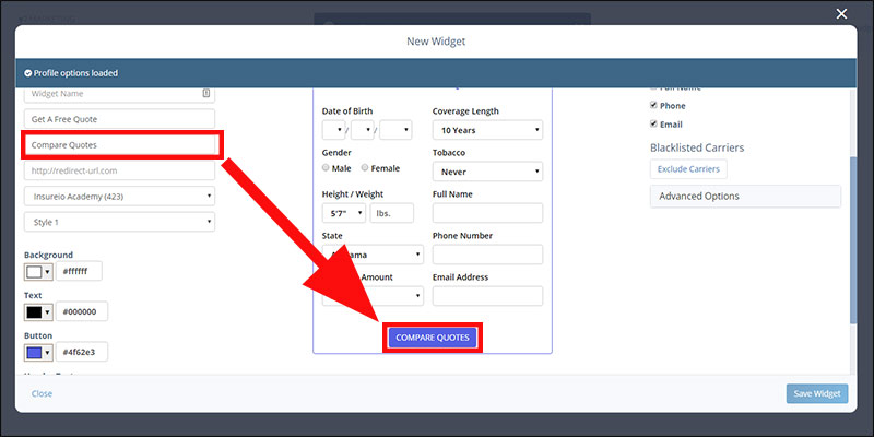
Since we’re only testing a call to action, it’s a pretty easy change to make. Let’s say we built the quoter we’re using in Insureio. To make a change, log into Insureio and edit the existing quoter's button text, as shown in the image below. Save your changes, copy the new code, and paste it into your site in place of the old code. If you prefer, you could also build a new quoter, give it a new name that specifies the element you’re testing, and replace the old quoter’s code with the new code.

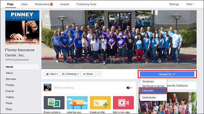
Or, let’s say we’re testing the call to action on our Facebook page. Hover over your button, and select the "Edit Button" option. Facebook limits your options here, but you can still choose from options like contact you, learn more, join your community, and more.

Evaluate Your Results
When the test period is over, use Google Analytics and your CRM’s reporting feature to gather the necessary data—visits, leads, etc. If you were testing your Facebook page, you can get similar data from Facebook Insights, and compare it to the number of leads you received in your CRM.
Once you’ve gathered the data, analyze your control period against your test period results. Which CTA garnered more clicks? Did conversions go up or down? Are there any reasons why the control period and the test period might have different results (i.e., events that altered consumer behavior patterns or access to your site during that time?
Not all tests will result in a clear winner. You may have a marginal gain or loss. If that’s the case, you can always run a second test with another CTA.
The good thing about testing a CTA is that it’s a small change that you can be relatively sure affects your click-through rate. If you were to change, say, the image on the page as well as the CTA, you’d have a harder time knowing which change influenced your site visitors. For this reason, it’s best to test one thing at a time.
Step 4: Plan Further Testing
CTA testing is the easiest to start with because the variables are small and easy—a few words, at most. But there’s a lot more you can do, both with CTA testing and other elements like images, headlines, and placement.
For example, MarketingSherpa recently described a landing page test their parent organization, MECLABS Institute, ran with a research partner. They created three landing pages—one control, and two experiments. Both the experimental pages had a different headline and image from the control page. In addition, each experimental page had a different call to action. This allowed researchers to answer two questions at once:
- Which image/headline pair performed better?
- Within the subset of the two experimental pages, which call to action performed better?
As it turned out, both experiments outperformed the control page. One experimental page boosted the click-through rate by a whopping 277%, resulting in an overall 82% increase in conversions. Within the experimental pages, one call to action (Request a Free Copy) generated 132% more click-throughs than the other (Sign In and Order a Sample).
Ready to optimize a call to action?
Testing doesn’t have to be a long, complicated process. Start with one call to action in one location. Over time, you can build up a library of data that helps you make better marketing decisions and increase your conversions.
