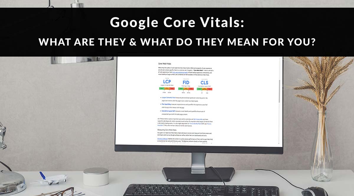
Over the past couple months, you might have seen web chatter about Google Core Vitals – a set of stats about your website’s performance that indicates how user-friendly your website is.
In the past, Google has focused on mobile usability, speed, intrusive pop-ups, and security. Now that most websites are mobile-friendly and using HTTPS, Google has turned its attention to user experience.
No time to read? Watch our video overview:
Anytime Google focuses on something, you can bet they’ll tweak their algorithm to reward what it wants to see. So far, user experience is no different – Google announced that “Google Page Experience” will become a ranking factor in 2021. Core Vitals are an important part of that.
So what are these Core Vitals? And what can you do to keep Google’s algorithm happy with your site?
What Are Google Core Vitals?
On May 5, Google launched their Web Vitals program. As they define it, this is “an initiative by Google to provide unified guidance for quality signals that, we believe, are essential to delivering a great user experience on the web.”
“Core Web Vitals” are one part of this larger Web Vitals program. These core elements of user experience affect all websites – i.e., they have nothing to do with your content quality. These are technical issues that might keep users from being able to interact with or consume the content on your site in a timely fashion.
The three issues Google wants us to pay attention to are:
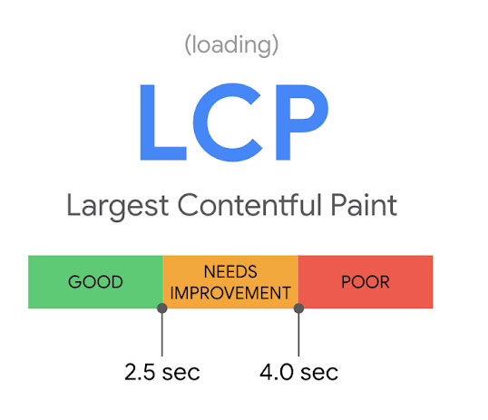
- Site loading time. They’re measuring this in a metric called “LCP,” or “Largest Contentful Paint.” (I don’t know about you, but the made-up word “contentful” makes me grind my teeth.)
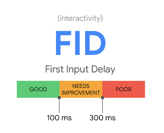
- Ability for fast interaction. This metric is “FID,” or “First Input Delay.”
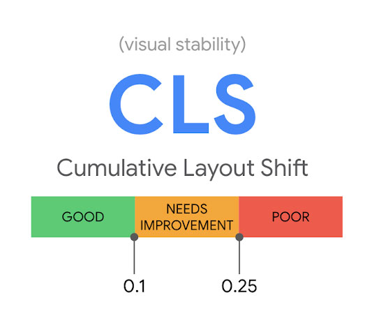
- Stability of the site as it loads. This metric is “CLS,” or “Cumulative Layout Shift.”
Now let’s find out what the heck these really mean, since the language feels almost deliberately obtuse.
LCP: Largest Contentful Paint
This is a fancy way of saying, “How fast does the viewer’s screen fill with the biggest piece of content that’s supposed to be there?” For most web pages, the first item to load above the fold is probably a logo, hero image, or text. Google wants a site to load these elements in less than 2.5 seconds.
FID: First Input Delay
Once a website’s content loads, what happens next? In most cases, the user consumes that content and either scrolls or clicks a button. If a site is super-slow or badly coded, however, sometimes those buttons or scrolling mechanisms don’t work right away.
First Input Delay (FID) is the length of time it takes a site to allow interactivity after the above-the-fold content becomes available. Google wants your site to allow interactions less than 100 milliseconds after the content loads.
CLS: Cumulative Layout Shift
Has this ever happened to you: a site starts loading and you start reading the text, only to lose your place when an image loads and the text jumps further down the page, below the fold? Yeah, Google doesn’t like that. It leads to a bad user experience, especially if you were trying to click or tap a button that jumped after another element loaded.
Cumulative Layout Shift (CLS) is the technical term for when content and elements jump around on the page as they load. Google wants your page to stop jumping less than .1 second after LCP.
How to Measure Core Vitals
So we know what metrics Google wants us to have for these 3 Core Vitals. How do we test our sites and get a reading?
There are several different testers you can use, but the easiest two are:
WebPage Test
Available at: https://www.webpagetest.org/. This testing tool does not belong to Google, but it has Core Web Vitals built into its results. Just enter your website URL and click “Start Test.”
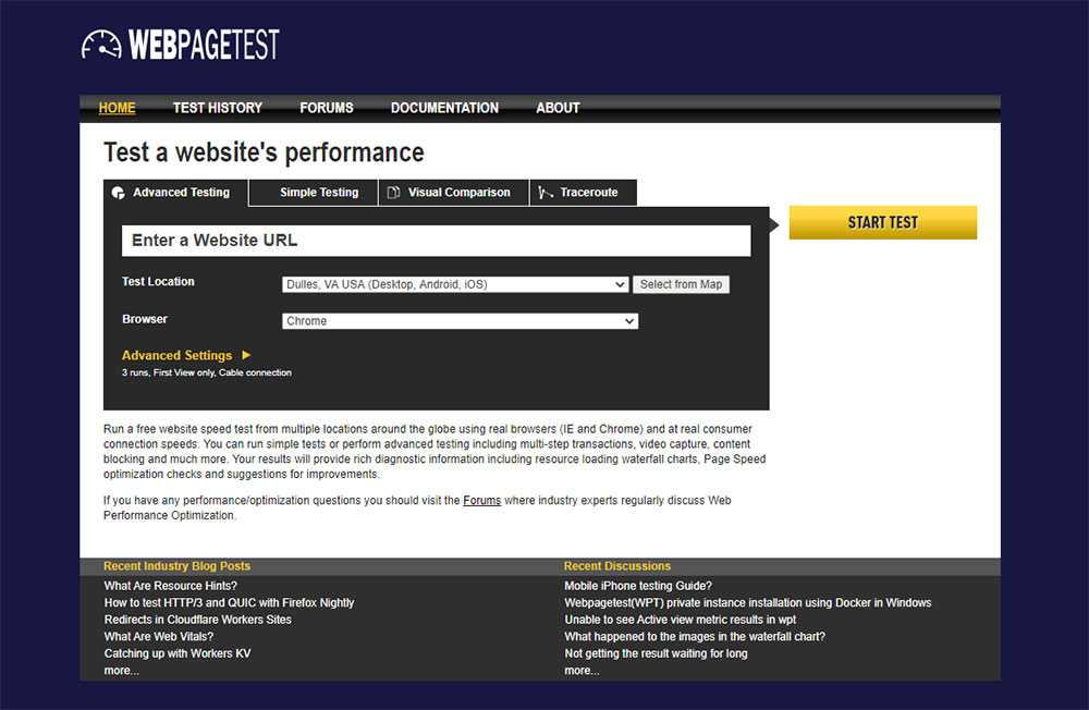
Once you get your results, look for the “Web Vitals” header to see relevant scores.

The cool thing about this test? It automatically runs 3 tests to replicate how your site functions on desktop, Android, and iOS systems. You can see the result on each if you scroll down your results page.
Google PageSpeed Insights
Available at: https://developers.google.com/speed/pagespeed/insights/. This tool gives you real results from actual Chrome users who visited your site. You might not realize it, but Google Chrome tracks data from the sites Chrome users visit and uses that data to compile the stats you see in your insights here. To check your site, enter your website URL and click “Analyze.”

Once you get your results, you’ll see they’re already broken out into Core Vitals. You can toggle between results for mobile and results for desktop.
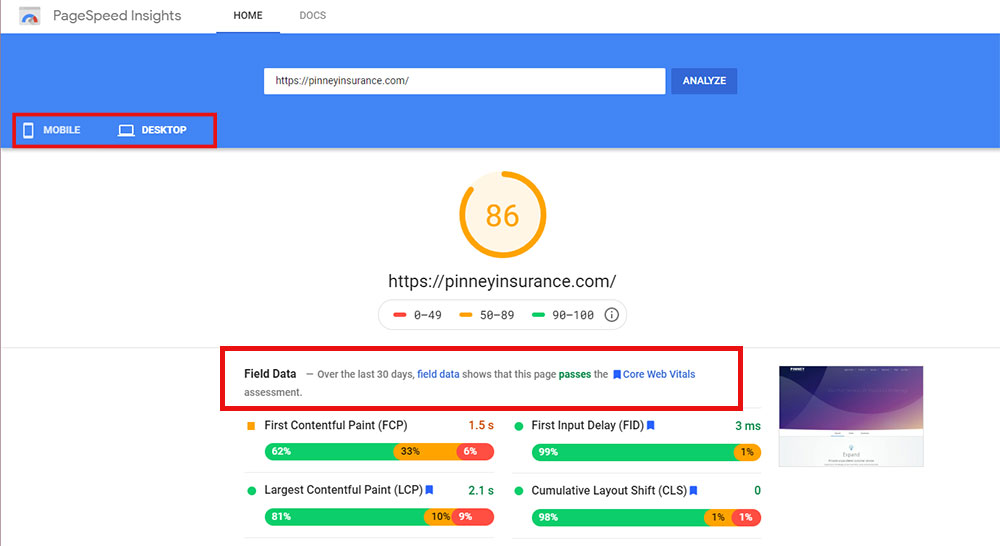
Another cool thing about this tool is the suggestions it makes to get you started on fixes. Granted, many of these will be technical – you may not understand what they’re asking you to do. But that’s okay – a developer or freelancer will, and Google’s tips can point them in the right direction.
What Do I Do if My Scores Aren’t Good?
That depends – every site is different, and only your test results can tell you what needs to be addressed. And as we mentioned, a lot of the fixes are on the technical side, such as combining css and javascript files. Your best bet for those is to hire a developer or consultant to point you in the right direction. But there’s one tweak you can probably do yourself, and it has to do with your site’s images.
Site Images
Images are often the number one culprit when we’re looking for reasons a site loads slowly. If your end user’s bandwidth can’t handle your site’s images, chances are they’re going to navigate away while your page is loading.
You can see how your images stack up by popping your URL into the Cloudinary Website Speed Test Image Analysis Tool. This free tool shows you how much the images on your page “weigh” in terms of size, and how much more they can be compressed.
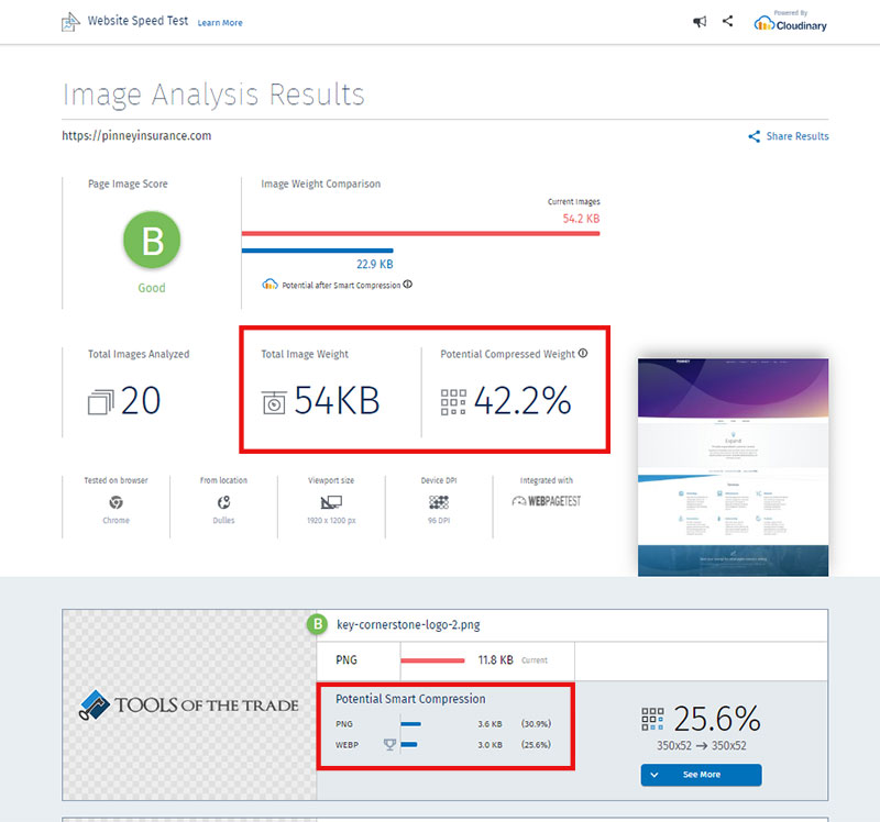
Found out your images could be compressed more? Here’s what that means and how to get it done. It’s free and it’s easy, if a little boring.
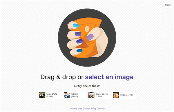
- Compression. If you’re a Photoshop user, you probably already know about “Save for Web.” But Photoshop is running behind the times – there are free apps online that do a much better job with compression. Squoosh is a fantastic free compression app. Just drag your photo onto the app, tweak their settings to your liking if needed, and download a much smaller version of your original image. Easy!
- Format. In the good old days, your web images were probably all JPEG or PNG files. Today, there are more options that provide better compression, including SVG, WebP, MozJPG, JPEG 2000, JPEG XR, and more. And guess what? Photoshop can’t export to any of these. But not all browsers are compatible with these next-gen formats. WebP, for example, won’t display on some versions of Internet Explorer and iOS Safari. Your best bet is to check your analytics and see what browsers your website visitors use. Compare that to the results for a next-gen image type on CanIUse.com, and make an informed decision. If the vast majority of your users are on modern browsers, go for WebP. If not, stick with JPEG and PNG files. Use free conversion tools like Squoosh and Online-Convert.com to make sure they're well-compressed.
That’s our look at Google Core Vitals!
As we mentioned above, tools like Google PageSpeed Insights will also give you recommendations that are too technical for us to cover here. But since these Core Vitals won’t becoming ranking elements until 2021, you have time to study up yourself, or hire a freelance developer to help you make some changes.
It’s daunting, we know – you just want to sell, not hassle with your website every year at Google’s whim. But these changes really are for the better. The intent is to push website owners to make their websites lighter, faster, and better for their users. If you generate leads from your site, a good user experience should always be your end goal.
