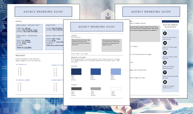
Brand guidelines help you create a unified look, feel, and tone in your marketing efforts. From social media images to emails to business cards, these guidelines make sure everything you put into the world shows your business at its best. Whether you’re working alone, have an assistant, or outsource your marketing, you’ll get more bang for your buck when your marketing adheres to a simple set of written guidelines.
In this post, we’ll show you how to create your brand guidelines, from choosing standardized fonts and colors to writing your agency’s philosophy. Gathering this info now will save time later—no more scrounging on a hard drive to find your bio, or wondering whether you have a high-res version of your logo.
We’ll cover a lot of territory in this post, so feel free to bookmark it and come back later. To make it easy to get started, we’ve created a free brand guideline template in MS Word and fillable PDF form. Download it, and fill it in as you work through the sections below. Nifty!

Jump to a section:
Logo
Colors
Fonts
Message
Imagery
Step 1: Create and Standardize Your Logo
Does your agency have a logo? If not, your first order of business is to design or commission one. Some agents use their name as their logo, while others use a small graphic in combination with their name. If you’re not confident in your design skills, you can commission a logo from designers on sites like 99designs, Upwork, or PeoplePerHour. Your local college’s graphic design department may be a great place to ask for help, too.
The colors in your logo should reflect the overall look you want for your brand. You’ll incorporate these colors into your website, letterhead, business cards, and social media images. If you have preferred colors, tell your designer ahead of time. We’ll talk more about selecting an approved palette of colors based on your logo in step 2. In the meantime, SitePoint.com has a good introduction to the meaning of colors. Blue, for example, can represent freshness and renewal. Green can represent wealth, growth, and health. If you’re starting from scratch or doing a redesign, you have the opportunity to pick something meaningful to you.
As an example of a simple logo that’s just text, check out our Pinney Insurance logo. It’s in dark blue, which conveys authority and professionalism:

As an example of a more complex logo that incorporates a brand name and varying typography, here’s WholesaleInsurance.net’s logo. It’s in blue and gold, which conveys professionalism with a sense of fun and friendliness, perfect for a consumer-facing site:

Tips on Logo Variations
Once you have your logo, take a moment to think about how and where it may be used. Chances are, you’ll need variations to fit the size constraints of social media networks, email templates, and more.
For example, if your logo contains text and an image, is it okay for the image to appear without your name? If your logo is your full name, what happens when you need a small, square version for your business’s Facebook profile image? Will you use your personal photo in that case, or a version of your logo that contains just your initials?
It’s a good idea to have at least two variations handy. Most social media profile images are square, but rectangular images look great in email headers and letterhead. We created a square version of our logo just for use on social media, rather than squish our text logo into a small space:

Create Commonly Used File Sizes & Types
Once you have a logo, you need a range of sizes and file types. You want to make it as easy as possible for you or your staff to find the right size and file type instantly. For example, if you’re adding a logo to your website, you’ll want a small file size that’s compressed to load quickly. If you’re adding a logo to a business card, you’ll want much higher resolution for crisp printing.
Good designers will provide you with a range of file types suitable for common business uses. Some will also give you a copy of their original file, most likely an Adobe Illustrator AI or EPS file. You won’t be able to open this file, but you can provide it to future designers or printers for the highest quality output.
Create a folder in a readily accessible location. In it, you’ll want to store the following:
- If available, a copy of the designer’s original file
- JPEG files with a resolution of 72 dpi suitable for digital use in at least the following sizes:
- small (>100 pixels wide), medium (>500 pixels), and large (1000+ pixels wide)
- PNG files with a resolution of 72 dpi suitable for digital use in at least the following sizes:
- small (>100 pixels wide), medium (>500 pixels), and large (1000+ pixels wide)
- A JPEG version of the largest file size with a resolution of 300+ dpi – this is your high-res version
- A PDF version of the largest file size with a resolution of 300+ dpi suitable for print use
- A black-and-white or grayscale version, if your logo includes color
Step 2: Standardize Your Brand Colors
Your brand colors will be dictated largely by your logo. If your logo is black, white, or only contains one color, you have a little room to play with accent colors. Design principles dictate using a range of 3 or 4 colors, often one bright color with 2-3 neutrals. We’ll show you a fast, easy way to create a great color palette below. Seriously—it will only take you a couple of clicks.
When it comes to both digital displays and color printing, colors are reduced to a series of codes. There are 16,777,216 possible color combinations for using codes to specify a web color—in this case, specificity matters. We’ll show you easy ways to find the codes for the exact shades you want to use. As part of your brand guidelines, you’ll be gathering and storing three codes for each color—RGB and hex code values (for web use) and CMYK values (for print use). This ensures that no matter where your branding appears, it always looks the same.
Choosing Your Colors
If you’re not artistic, never fear—there are super-easy ways to create attractive color combinations online. Use Design-Seeds.com or Adobe’s Color to generate quick, done-for-you color combinations that look great. If you have an Adobe Creative Cloud account, you can log in and save your palettes. If not, you can still use the tool to generate a palette and jot down the color codes.
Design Seeds
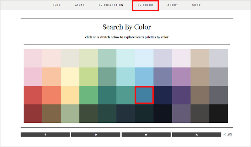
- At Design-Seeds.com, click “By Color” from the top menu bar. Next, click on a color.
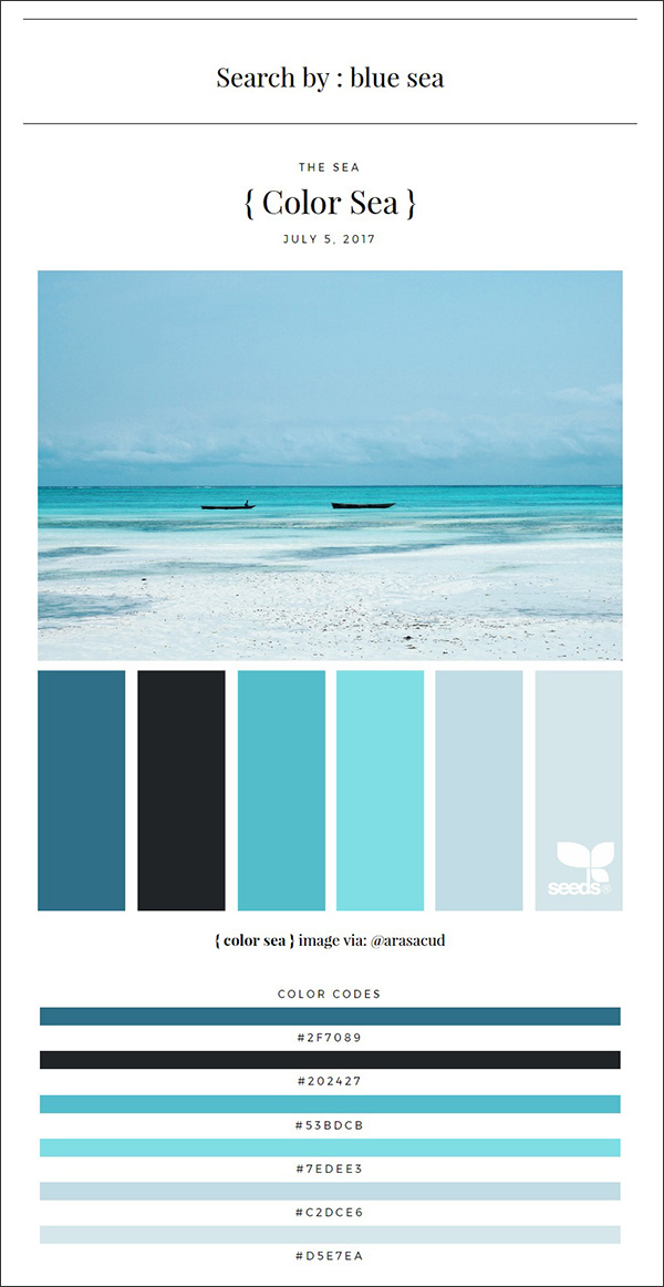
- You’ll get a “mood” image, a palette of complementary colors, along with the hex codes for each. It doesn't get much easier than that.
Adobe Color
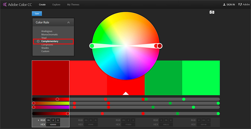
- At color.adobe.com, select the type of palette you want. For example, “Complementary” provides a selection of colors that complement the first color you choose on the color wheel. The best way to get a feel for the different settings is click around and play with it a bit.
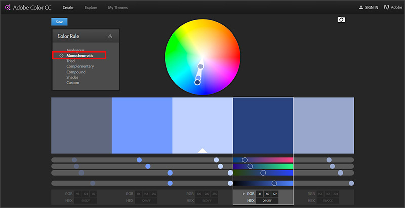
- Use your mouse to drag one end of the color wheel into your brand’s primary brand color. The other end of the color wheel will set itself based on the palette type you chose. You can drag either end into a different color if you want. Just click and play—you’ll get the hang of it. In the example below, we picked a monochromatic scheme, so both handles of the color wheel are near each other.
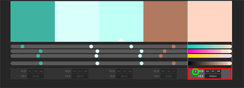
- When you find a palette you like, take a screenshot and jot down the RGB and hex codes below each color. Click the arrow to the left of RGB to reveal the CMYK codes, too (arrow circled in green below).
Standardizing Your Colors
Now that you know which colors represent your brand, store all three codes for each color (hex, RGB, CMYK) in an easily accessible place. Download our template and you'll find a section already created for your color codes. If you don’t have each type of code, you can use one of the handy converters below:
Step 3: Standardize Your Brand Fonts
Typography is a key part of your brand’s look and feel. Fonts convey a mood—and we’re not talking about the fact that designers get really mad when they see Comic Sans. For example, check out the fonts John Hancock uses on the web page for their Vitality program:

While the font used for the word "vitality" is great for a consumer-facing program, it’s probably not a font you want to use to represent your agency as a whole. Instead, you probably want something that conveys authority and efficiency. The font they chose to describe the program definitely conveys this feel.
It’s best not to get too crazy with typography. Most designers recommend choosing one font for headlines and one for body text—that’s it. If you aren’t working with a designer, there’s a lot you can do yourself. The website fontpair.co recommends great pairings of fonts that are free to use commercially. Just click around, find a pair you like, and you can download them together in a single zip file.
Here are two font resources, if you’re inspired to learn more:
- Typewolf – get lists of best free fonts, best font combos, and more
- FontSquirrel – free fonts licensed for commercial use
What to Include in Your Brand Guidelines for Fonts
Include the names of any fonts you use in print or web-based documents. Ideally, these would be the same—you want a consistent look and feel over your website, PDFs, and social media images. If you're using non-standard fonts (i.e., not Calibri, Arial, or Times New Roman), it's a good idea to store a copy of the actual font file with your brand guidelines, too. New employees can grab it easily, and so can you when you get a new computer and need to reinstall these fonts.
To locate fonts on your computer, go to Control Panel / Appearance and Personalization / Fonts or Control Panel / Fonts.
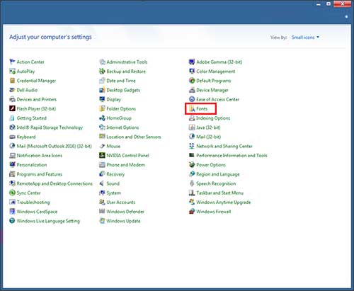
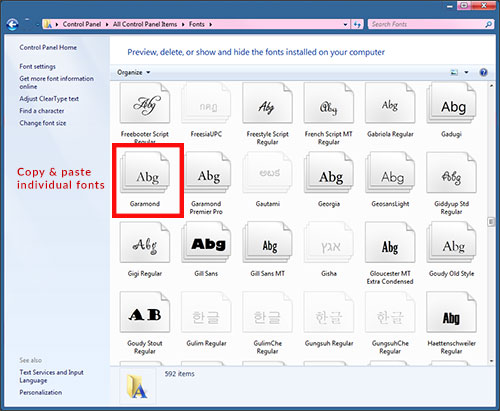
Right-click the font you want and select Copy. Paste it into the folder where you’re storing your brand guidelines.
If you have stylistic requirements for typography, note them in your guidelines as well (heading must be in all caps, for example).
- My logo uses the following font(s):
- My website uses the following font(s):
- Headline font:
- Size:
- Stylistic notations (all caps, different color, etc.):
- Body text font:
- Size:
- Stylistic notations (all caps, different color, etc.):
- My social media images use the following font(s):
- Headline font:
Step 4: Standardize Your Brand Message
Quick—describe your brand in 5 words. Can you do it?
We’re not talking about words like “helpful” or “knowledgeable,” either. No, we’re talking about the quirks and characteristics that make you you. Are you funny? Sophisticated? Well-traveled? Down-to-earth? Energetic? Like to tell jokes? Drink out of a mug with a funny saying on it? Make clients smile by explaining things using sports metaphors?
Try to zero in on the things that make you and your brand unique outside of products, pricing, or industry knowledge.
If you get stuck, try choosing words you want to represent your brand.
Also include words you prefer to use in sales pitches and client meetings. For example, many agents don’t want to use words like “cheap” or “low-cost” when talking about term life policies. The word you might want to use instead is “affordable.” If you have preferences like these, include them here.
- My brand is: _____, _____, _____, _____, and _____.
- Words I like to use when describing insurance or talking to clients:
Next, you’ll do the same exercise, but you’ll identify what your brand is not. This is helpful if you delegate tasks like writing blog posts or posting on social media. This section might include things like being political, negative, using jargon, or chasing too many trends. Also include any words you don’t want to use in your branding, such as “cheap” or “low-cost.”
- My brand is not: _____, _____, _____, _____, or _____.
- Words I don’t like to use when describing insurance or talking to clients:
Brand Statement
Now that you have your brand characteristics, you can create your brand statement. Think of this as a mission statement in less than 200 words—what are you here to do? How will you do it? What’s your personal philosophy on insurance and customer service? Why does it matter to you?
This statement will give you (or whoever works on your marketing) a quick way to inject meaning into emails, blog posts, and social media content. Sometimes it’s easy to get lost in the daily slog that is marketing. Post here, blog this, send that…if you feel yourself losing connection with the why, re-read this statement. Everything you put forward should tie back to the emotion you captured here. For example, if you’re blogging, why did you pick that particular topic? How does it help you fulfill your brand statement? Explaining this in 1-2 sentences gives you a great introduction or conclusion for your post.
Your brand statement works in conjunction with your bio, discussed below. The two of these represent a readily available source of content to post on any social media profile, the “About” page for your blog, the “About the Author” page in your eBooks, your speaker bio for a conference or award ceremony, etc.
Agent & Agency Bio
Like the brand statement, your agent or agency bio is a key component of your brand guidelines. Anything you include in this bio is fair game for mentioning on your website or in social media posts. Even if you’re the only one creating content right now, this job might belong to someone else in the future. They need to know what’s okay to mention.
If you already have a standard bio or “About” section on your website, paste that copy into a new Word doc and store it with your brand guidelines. If you don’t, write approximately 250 words detailing who you are, what you do, where you were educated, awards and nominations, publications, and anything else the public should know about you. This can include your immediate family, hobbies, and where you live, if you like.
Step 5: Standardize Your Brand Imagery
In today’s digital world, images are what draw people in. Every social media profile has a header image, a big space for you to convey who you are in a single picture. Similarly, your website and PowerPoint presentations probably have pictures that convey a sense of security, happiness, wealth, etc. There are ways you can standardize the look and feel of these images so that no matter where you share them, they convey your brand’s look and feel.
Here are two ways to standardize your brand imagery:
- Watermarks and branding. Many brands place watermarks or branding on their images before they post them. If the image gets re-shared, it’s always going to appear with that business’s name, logo, and/or URL. You don’t want to get too crazy with the branding on an image - keep it subtle. It's easy to upload your image to Canva or PicMonkey, add small text or a logo, and then post it. If you add branding, make sure it’s in your brand-approved font and colors. Here’s a before-and-after sample to show you the difference a little branding can make:
- Filters. Popular brands and celebrities on social media (especially Instagram) often use a signature filter to make sure their posts all have a similar look. You can do the same thing, with or without Instagram. If you’re not familiar with filters, they’re pre-set photo effects that change the color balance, tint, or focus of a picture. They’re a fast, easy way to make photos look professional. Both Canva and PicMonkey let you add filters to your photos. Here’s a before-and-after sample that shows how filters can make a simple photo a bit more stylish and eye-catching:

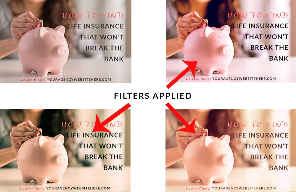
Take a few minutes to experiment with filters and branding. Once you have a formula you like, it's easy to replicate later. Now everything you post on social media will look more appealing to a future client!
These five steps will help you set and maintain a consistent tone in your marketing.
It may seem basic, but you'd be surprised how many agents never take the time to work out their brand messaging or standardize their colors and fonts. You'd also be surprised how much time having a standardized bio will save you. In a prior post on local SEO, we talked about the importance of standardization. This is a great first step. Whether you create emails, eBooks, blog posts, paper letters, PowerPoint presentations, social media posts, or all of the above, your clients and prospects will develop a sense of who you are just by seeing your materials.
