
For people outside our industry, insurance is just plain confusing.
From concepts to products to vocabulary, life insurance isn’t something most people understand…or want to understand, if we’re being honest.
It’s critical that your client communications are easy to read and don’t require a dictionary to decipher. Gone are the days of formal, stilted writing – if it sounds complicated, that must mean it sounds professional, right? Not anymore. Talk to prospects in writing the same way you’d talk to them in person.
After all, user experience is about more than making website buttons big and easy to click. It’s about giving customers what they need, not what you think they need. It means avoiding the temptation to try and sound smart. It means making any transaction seamless, right down to the words in an email or text message.
So let’s break that down into actionable tips and insights you can apply right away.
No time to read? Watch our video overview:
Here are 7 tips for better client communication.
Tip #1: Don’t use jargon.
Have you ever looked at a foreign-language website or book? Or tried to read a paper in a medical journal? Even if you recognize the words, it’s hard to find a meaning you can grasp.
That’s how prospects feel about insurance content.
To help fix that, use the “explain it like I’m 5” concept in your consumer-facing materials. If you’ve seen this phrase on Reddit, you know where we’re going with this. It’s a way of asking for a simplified explanation of a complicated concept. After all, Albert Einstein once said, “If you can’t explain it in the simplest way, you haven’t understood well enough.”
There are a couple ways to do this:
- Jot down the questions clients ask during calls or meetings. What words or concepts confuse them? Look out for these on your website or marketing materials.
- Ask friends or family members if you can pick their brain for a minute. Run your simplified explanation by them and ask for honest feedback.
- Create a client survey (or add questions to your existing client survey). Ask them which concepts or words were confusing to them. As a follow-up, ask if that confusion was cleared up during your calls or other interactions…or if they still have questions.
Example: A Web Page with Too Much Jargon
The screenshots below come from a carrier webpage on life insurance. The top part of the page introduces life insurance in a couple paragraphs, followed by a couple more on term vs. permanent/cash value policies.
But then, the carrier asks the consumer to leave the page to learn about cash value life insurance – and tells them “the core concepts are easy to understand”:
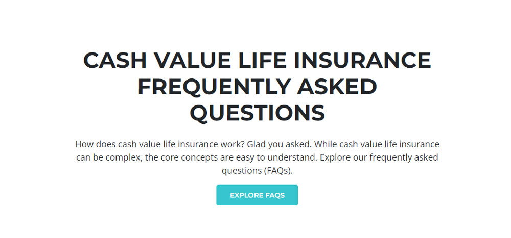
And immediately afterward, they present IUL and VUL like this:
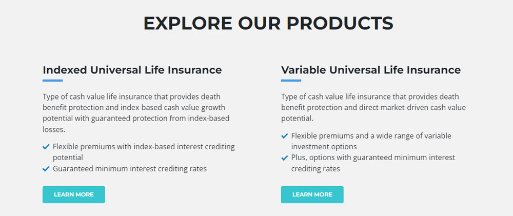
Houston, we have a problem. What average consumer is going to understand the difference between “index-based cash value growth potential” vs. “direct market-driven cash value potential”? Are these “easy to understand” concepts? To your average consumer, this is a grab-bag of words. The more of them you string together, the less clear their meaning becomes.
Avoid confusing the consumer with jargon that comes out of nowhere like this. If you want to talk about complicated subjects, you have to introduce them, define your terms, and provide context - none of which happens here.
Tip #2: Give a simple definition the first time you use a term.
If you must use an insurance-specific term, always define it first. For example, your client probably knows what the words “surrender” and “value” mean. But don’t assume they can automatically translate that into insurance-speak.
But “surrender value” is still a relatively complicated example.
You may want to start with something even more basic. For example, here’s the definition of a “policy” from Insurance Nerds’s “Simplest Insurance Glossary”:

Note how they said “written paper” instead of “document.” Notice how they said “long words” instead of “complicated language.” This is something everyone can understand.
It’s up to you just how simplified you want to get.
But consider how you feel when other professionals rush through an explanation without defining their terms – your doctor, your accountant, or your lawyer, for example. If you care about educating your client, take the time to slow down and define what you’re talking about.
Tip #3: Use active instead of passive voice; zombies will tell you which is which.
Once you know how to spot it, you’ll see passive voice everywhere – especially on insurance and medical websites. Some people think passive voice makes their content sound professional and authoritative. It doesn’t. It turns content into the written equivalent of a limp handshake.
Now, let’s define those terms:
Passive voice is when you can’t tell who is taking the action described in the sentence.
Active voice is when you know who is taking the action.
A helpful way to tell them apart? Add the phrase “by zombies” to the end of the sentence. Or, if it’s a really long sentence, after the verb. If the sentence still makes sense, it’s in passive voice. If it doesn’t make sense, that sentence is in active voice.
PRO TIP: There are free passive voice checkers online you can use to spot this flaw. We’ll explain how to spot it and fix it below, but you can also use DataYZE.com’s passive voice checker.
Example 1 - Passive voice: "The procedure will be performed in our office."
Why it’s passive: Who is performing the procedure? It could be Dr. Frankenstein, for all you know.
The zombie test: "The procedure will be performed in our office by zombies." Yes, the sentence still makes sense, so it’s in passive voice.
Example 2 - Active voice: "We perform the procedure in our office."
Why it’s active: You know who’s performing the procedure – “we” refers to a specific group of people, including whoever is speaking or writing this sentence.
The zombie test: We perform the procedure in our office by zombies. That makes no sense, so it’s in active voice, not passive voice.
Example 3 - Passive Voice: "The application must be completed within three days."
Why it’s passive: Who is completing the application? We know when, but not who.
The zombie test: "The application must be completed within three days by zombies." Yes, this makes sense, so it’s in passive voice.
The fix: Make it clear who performs the action. Try, "You must complete the application within three days" or "Please complete the application within three days." Now, there’s absolutely zero ambiguity about who must complete the application.
Tip #4: Use short sentences.
Back in high school, teachers wanted you to write in complete sentences. But the world has picked up the pace since then, and so have your customers. They don’t have time for long-winded sentences. They’re skimming, they’re browsing, and probably doing five other things at the same time. And if you deliver content with sentences that sprawl over three lines on the page, they’re going to lose their place. Or their interest. Or both.
So keep it short and sweet! That formula works wonders for Seth Godin, as you can see from this blog post:
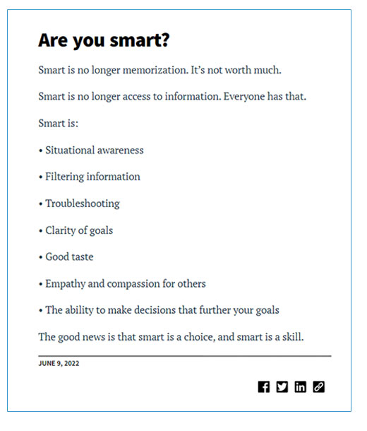
PRO TIP: Read a sentence out loud. If you start running out of breath, it’s too long. Aim for no more than 20 words per sentence.
Tip #5: Use short paragraphs.
This tip will help you avoid presenting your customer with the dreaded “wall of text.” If you’re crafty with design, you can use images and subheadings to break up text in a website or blog post.
But not all client communication is web-based. You might be writing a client email, which probably won’t have subheadings or images.
The trick here? Keep their eye moving down the page with short paragraphs that are easy to digest.
The more paragraphs they can skim and read easily, the further they’ll get through your content…and the more achievement they’ll feel.
Kind of like we’ve done here. ;)
And kind of like what Matthew Howells-Barby did in the email below. He took on a complicated subject, the metaverse, and broke it down into multiple paragraphs no longer than 2 sentences. As a former VP of Marketing for HubSpot, you can bet he knows what works in email marketing:
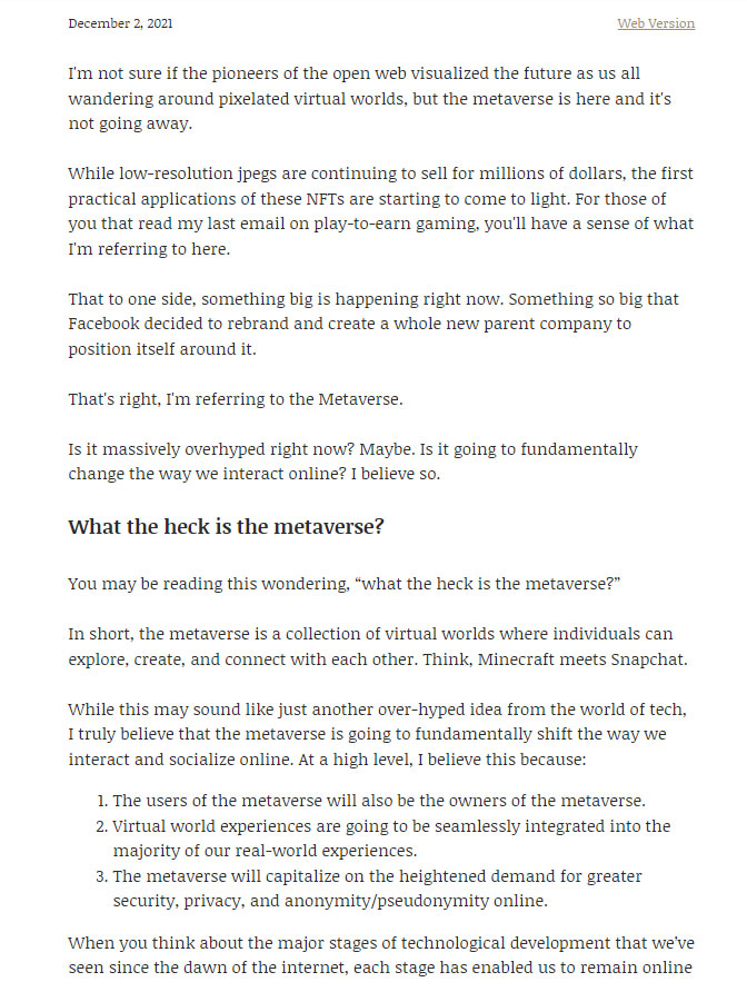
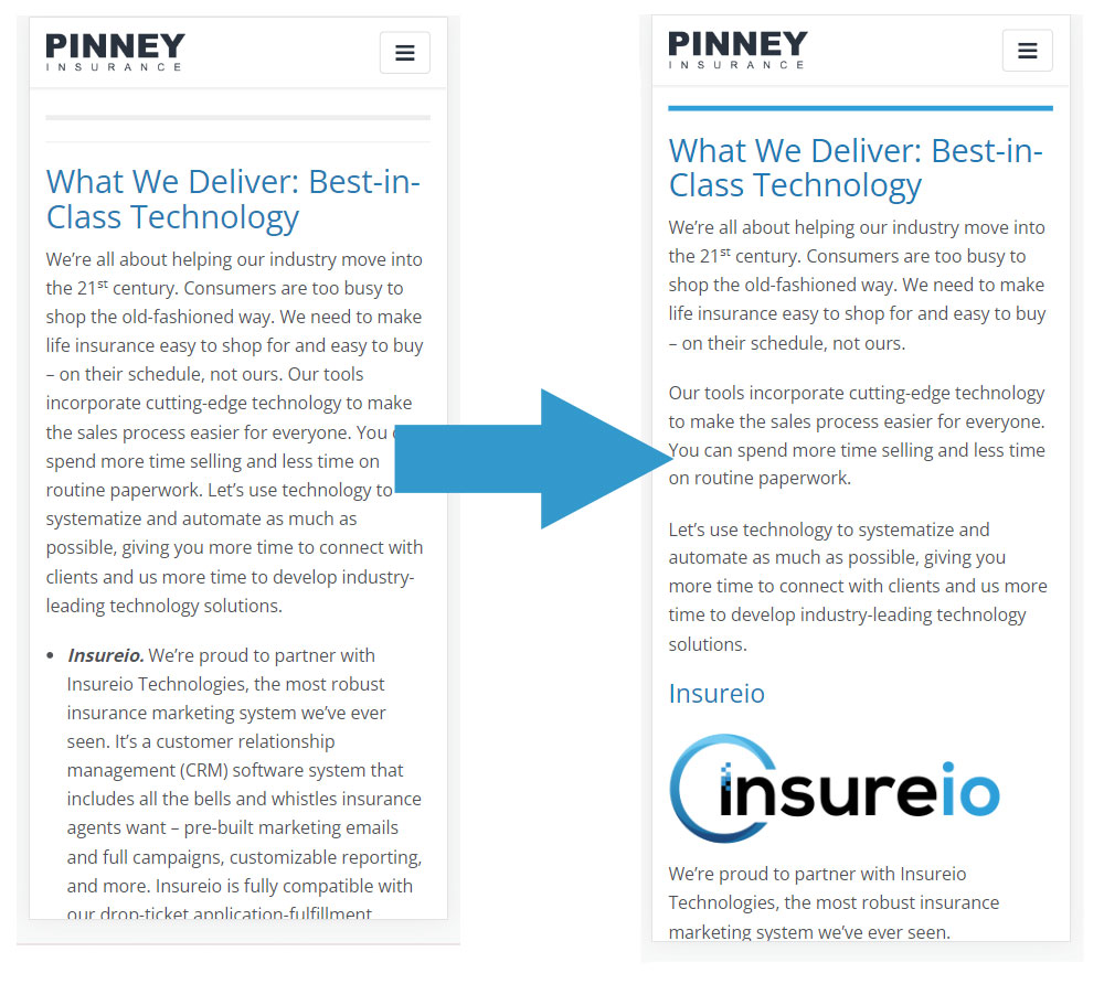
It's hard for a reader to achieve progress and flow with a “wall of text” – especially on a mobile device, where long paragraphs seem to scroll forever. If you haven’t taken a look at your website in a few years, do it on your mobile device. Are there paragraphs that seem endless on your phone’s screen? If so, break them up, like we did in the example below:
Tip #6: Use contractions.
It still surprises us how few professionals use contractions.
In the old days, contractions had an informal connotation and professionals frequently avoided them. But these aren’t the old days.
If you need a refresher, a contraction is when you connect two words by combining them and making them shorter. Here are a few examples:
You are: you're
She is: she's
It is: it's
Today, content without contractions comes off as stuffy and old-fashioned. No one is going to think you’re unprofessional for using “you’re” instead of “you are.” You want your content to feel like you’re having a conversation with your prospect. And virtually no one starts a conversation by saying, “I am happy to assist you today.” Instead, try something more personable, like “I’m happy to help.”
Plus, you have to think about where your prospects find you. If the answer is “social media,” think about the image you convey there. It’s probably friendly, open, and helpful. But is that the image your non-social content portrays, too? Or will prospects feel like there’s a time warp when they visit your website, taking them back 20 years with formal language, walls of text, long paragraphs, and no contractions?
Tip #7: Use a readability calculator.
Did you know there’s a calculator that can tell you how readable your text is? And tell you the average reading level of your text? It can’t tell you if your content is “good.” But it can tell you if your content is too advanced for most consumers to understand.
It’s called the Flesch Reading Ease Score. It grades content on a scale of 0 (hard to read) to 100 (easy to read). Ideally, you want something in the 70s or 80s. This puts your content at a 7th grade reading level. On our blog, we average 66-70, which is an 8th – 9th grade reading level. This post scored a 71.8!
Here’s a free online Flesch Kincaid Calculator.
As an example, we pulled the text from the carrier page we referenced above – the part with all the jargon (200 words). It received a grade-level score of 11, a reading ease score of 29.8, and a reading level of college graduate (very difficult to read):

This is not what you want for consumer-facing content.
As a second test, we ran a recent blog post from Seth Godin. It’s not the one pictured above, but it also features short sentences and paragraphs, clocking in at 162 words. Here's how it scored:
- Grade level score: 6.6
- Reading ease score: 68.2
- Reading level: 8th and 9th grade
The take-away? The ideas you express don’t have to be simple. But the way in which you express them should be…if you want those ideas to reach and persuade the general public.
That’s our look at 7 tips for better client communication!
How do you make sure you’re communicating clearly with clients? Tell us in the comments!
