Your FAQ page is an opportunity to make prospects and clients happy – don’t waste it.
A "frequently asked questions" (FAQ) page provides helpful information to prospects and clients. It answers common questions that people might have about your business, products, or services, and can also help to improve the user experience on your website.
In general, the goal of an FAQ page is to provide useful, accurate, and up-to-date information. If your website visitors find the answers they're looking for, it improves their overall experience on your website. It can also reduce the time you spend answering one-off emails and phone calls.
If you do it right, this page can:
- Convert a prospect into a buyer
- Reduce customer service calls & emails
- Help cross-sell and up-sell to existing clients
- Generate press & media opportunities
Let’s look at how to source content, organize it, and make it a good experience for your website visitors to use.
No time to read? Watch our video overview:
Content: What Goes on a FAQ Page?
First things first – you need to track what questions your clients and prospects already ask you.
Don’t treat your FAQ page as an opportunity for you to tell clients what you want them to hear. Save that for your sales pages. On this page, you have to focus on what they want to know. And the only way to do that is to track the questions you’re getting now. Start an FAQ file and add to it every time a client or prospect asks a question. Add to it by going through resources you already have:
- Browse past emails from clients.
- Scroll back through your social media & messenger accounts.
- Check notes from past client meetings.
- Review feedback you've received via online reviews, surveys, or other channels.
- Look at competitor websites.
As you’re creating your FAQ list, remember: if one client asked the question, it probably means others want the answer, too. As your middle school teacher probably used to say, there are no dumb questions.
If you want to include a section for journalists or press, this is your opportunity to convince them you’re a great source of information about life insurance. In this section, you’d want to include general information about your business, such as what you do, how long you've been in business, and any notable achievements, awards, or publications. They’ll use this information to decide if they want to contact you for a quote or interview. You may want to include answers to questions like:
- What credentials, degrees, certifications, or licenses do you have?
- Where can I see or hear you speak (audio or video clips, podcast interviews, etc.)?
- Where can I see what you’ve written (articles, books, etc.)?
- Are you available for quotes or interviews? If so, what’s the best way to contact you?
A 3-Step Formula for Answering FAQ Questions
Once you have a list of questions, it’s time to craft the ideal answer for each. By “ideal answer,” we mean the answer that gets a website user to the solution as quickly as possible. That may mean directing them to a different page on your site, summarizing information you’ve already included elsewhere, directing them to call you for individualized answers, or all of the above. We can boil this down into a 3-step formula:
- Summarize. Provide a quick 1-3 sentence answer, explained as simply as possible (no jargon).
- Elaborate. If necessary, create a second paragraph with more detail – or a link to a place you’ve already answered this question.
- Direct. Tell them what to do next. Do they need to contact someone? Provide the phone number or email address. Do they need to download a form? Provide the direct link. Do they need to make a decision? Provide a cheat sheet or worksheet they can use.
Structure: How Should You Organize a FAQ Page?
No matter how many questions you include, your FAQ page needs to be easy to navigate. That means breaking up your list of questions into sets of related issues. One good way to break this up is based on who your site visitor is: prospect, client, partner, or media. You’ve already seen this in action on most carrier websites:

For example, you could structure your FAQ page with a top section that asks browsers to identify themselves:
I am a:
life insurance shopper
current client
life insurance agent
journalist or media representative
Based on their click, you could then create groups of questions that are relevant to their experience. Here’s an example of what you might include for a section on current clients:
Questions about your current policy
Questions about your annual review
Beneficiaries: how to file a claim
Wondering what other insurance needs I can help with?
Within each category, you could then further subdivide the questions.
- Start with short nuts-and-bolts questions that have simple, factual answers. Why? This ensures that people who have an easy-to-answer question spend as little time as possible on that page. They don’t need a complex answer, so don’t make them dig for it.
- Place questions with complex or long answers toward the end of the relevant lists or categories. Those folks probably know they’re not going to get a single-sentence answer, so they already expect to be on your page for more than a few seconds.
Navigation: How Should You Build the Page?
Based on what we’ve covered so far, there’s probably going to be a lot of content on the page. How do you keep it from overwhelming your site visitors?
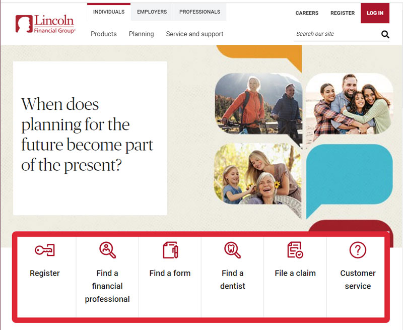
- Divide up the content using clear and concise headings and subheadings. This is the best way to wrangle information – it creates manageable sections and makes it easier for visitors to find what they're looking for. For example, Lincoln Financial uses these visual headings to separate sections of their consumer-facing site:

- Format using bullet points or numbered lists. This makes it easier to scan and read detailed information, particularly for lists of steps or instructions.
- Add hyperlinks. This allows visitors to quickly jump to the specific section of the FAQ page that they're interested in. This can save them from having to scroll through the entire page to find the information they need.
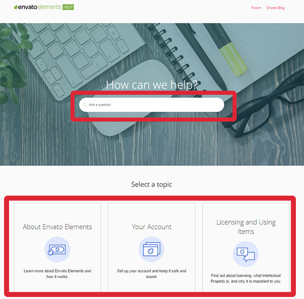
- Use a search bar or filter option at the top of your page. This is especially helpful for longer pages with a lot of content. You can see an example of this on the Envato Elements help page, which also uses clear and concise headings below their search bar:

Overall, the key is to make the information on your FAQ page as easy to access and understand as possible. This can help to improve the user experience on your website.
That’s 4 ways a good FAQ page can grow your business - and how to create and organize your page!
Are there any FAQ or help pages you've found helpful or visually interesting? Share 'em in the comments!
